.webp)


Subtitles and closed captions are the best ways to help the viewers understand the video with no sound. It also helps to reflect the personality of the brand name that you are promoting. Hence, subtitles with the right font create a rich video experience.
In this article, we will see some of the best fonts that the user can choose from for subtitles and closed captions. Subsequently, we will also learn how Wavel helps in choosing the best free subtitle and caption font.
Subtitles & Closed Captions
We all are aware of the two learning types:
- Visual stances
- Audio stances
Videos are preferred widely because of their inclusion of these two. However, it might prove to be a little difficult for viewers to focus on both arbitrary senses equally. That’s where closed caption vs subtitles play a huge role. Professionals make a point to include a standard font in their videos. Yes, nothing too fancy but understandable.
While adding subtitles, you have to make sure that the captioning does not take attention away from the video. One must be able to concentrate on the visual source while simultaneously glancing at the provided information. There is a vast algorithm behind choosing subtitles. Closed captions in videos promote:
- Flexibility in a sound-sensitive environment
- Better understanding
- Derivative content
Here, we will tell you how proper keywords and readable fonts promote you on the search engine. The more extensive and reasonable your word choice is, the more you will be seen in the viewer list.
The Role of Fonts in Attracting Viewers
There is an innumerable amount of fonts available from the finest software editors. With more than 150+ basic fonts that are pre-installed, a different catalog for custom fonts is also available. There is no question of ‘settling down’ because, from this plethora, it will be easier to get the best free subtitle font. The real dilemma here is choosing what font represents your company motto better. Here are the guidelines for the same:
- Look for a text type that is specifically informative and not too extra. This ensures that the viewer will take the help of the provided captions but will also not neglect the video entirely, omitting the rest of the visual source.
- The size of the text font is real confusion. However, our advice is to keep it moderate. Don’t make it extremely large because that would be a defect on the screen. It will cut the video out which deflates the whole purpose. Making it minuscule is also not a good option. No one likes to glare at the screen to make out the written words.
- Avoid usage of highly technological and trendy fonts as they take the attention away from the video. Popular trends are never on the consistent side and hence, something simple yet powerful will work fine.
- As a professional company/ website, every move you make is a direct representation of your company. Here, the closed caption vs subtitle you select is a part of that. If possible, stick with one font for the entirety of all videos.
There is also a lot of editing you can do in your captions to make them stand out. A little ‘pop drop’ or a ‘ shadow’ text might make a statement from your side.
Types of Fonts for Subtitles and Closed Captions
Opting for a particular font may vary for everyone based on either preference or experience. Some fonts are more sought out in the industry than others. We, at Wavel, bring before you some recommended fonts for your subtitle showcasing!
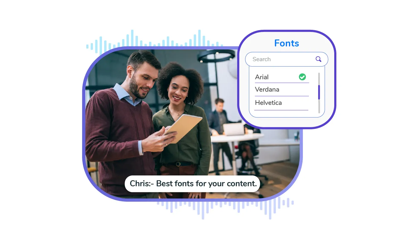
- Arial: This sans serif font is widely appreciated because of its simple persona. If you are not a fan of flashy text, this is your way to go. You can of course go for the Arial black as well but be careful of the bulkiness.
- STIXgeneral: More on the classy side, this serif font is great for documentation videos. However, with tons of text, it might get a tad bit difficult to make out due to the reality.
- Helvetica: As commonly referred to as ‘Helvetica Neue’, this has a recognized typeface of its own. It also has a large diversity of options available if you fancy a more specific text section.
- Futura: One word for this versatile text – flexible. It is fit for any and every video. No matter what vibe you are going for, it will make a difference in its way. For a lot of texts or a few spaced-out ones, this font is the most preferred one.
These are some of the best free caption fonts you can go for!
How Can Wavel Help you in Choosing the Best fonts for Subtitles?
Wavel is your go-to provider for the best voice solutions for video localization. It helps you choose and integrate the best fonts from a diverse range of font families for subtitles and closed captions. It helps the user to easily change and gives the flexibility to choose as per their design, interact better, and steal their attention.
Conclusion
The best way to deal with closed captioning vs subtitles is to ponder about the very purpose. It might take you a few hits or misses to finally decide upon the one font that blends but overall, this article covered it all. Finding the right font is an art but we trust you to be the best artist!
Reach out to us and we will ensure that we meet up with font compliance standards for subtitles and closed captions. This in turn will increase visibility and transparency about your brand name.
If you would like to reach out to us, you can do so by mailing us at reachout@wavel.co.